Fidelity
2025 - Now
MVP 1 Built
One place to manage every profile
How I replaced three legacy tools and a maze of menu links with one management experience for investor and professional profiles, then kept the quality bar through research, build, and pilot.
Role
Senior UX Designer, from workshops to QA
Team
Product owners | engineers | UX researchers
Scope
2 profile types, 4 jobs, 1 platform
Status
Overview
Four jobs lived in different places. I put them in one.
Admins who manage investor and professional profiles had to move between three tools, menu links, and tabs to finish a single task. Creating a profile, editing it, linking accounts, and managing permissions each lived somewhere different.
I designed one centralized experience: focused search fields, removable filters, a results grid, and a profile page that holds everything about a profile. Every workflow has two ways in, the Actions menu in the grid and the profile page itself.
Investor profiles are now in a pilot with participating firms, and the feedback has been warm. Professional profiles are in MVP 1, with designs done and handoff underway. I'm checking finished code as it lands.
The same three questions, at the scale of one tool
01
Can a designer find it?
Project pages, a getting started guide, and an intake system keep every decision in one place.
02
Do they know how to use it?
A pattern library, Figma templates, and component assets give every project the same starting point.
03
Can someone keep it going without me?
A weekly stand up shares what we learn. A RACI pilot is testing how contribution spreads across people, not just me.
2
Counted
Entry points to every workflow
The Actions menu and the profile page
4
Counted
Jobs in one place
Create, edit, linked accounts, permissions
2
Counted
Profile types
Investor and professional
Where each profile type is today

Status as of this writing. Professional profiles mirror investor profiles, with different management systems and linked accounts.
Stakes
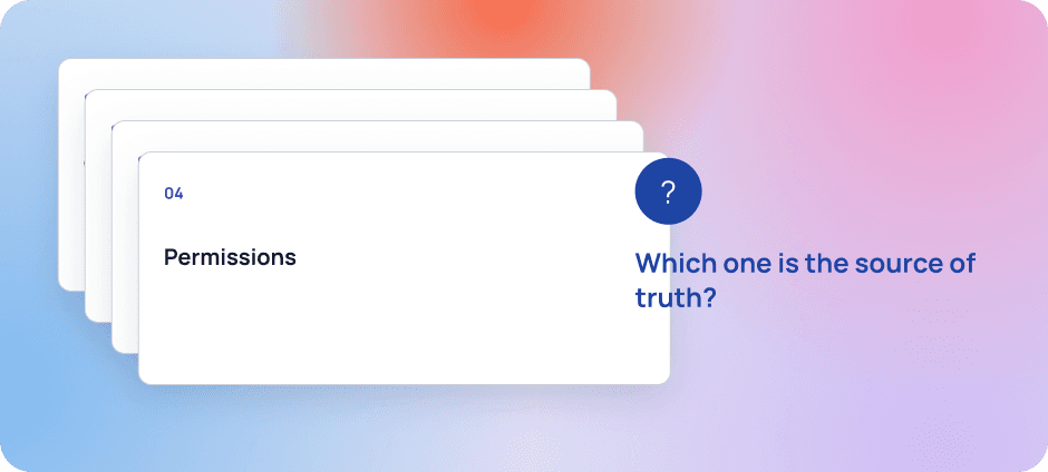
Finishing one task meant opening four tabs.
Tomás looks after access for a firm. On Monday a new advisor joins, so he needs a profile. Creating it lives under one menu link. Editing lives under another. Linking the advisor's accounts is a tab inside a third place, and permissions are somewhere else again.
By lunch he has four tabs open and isn't sure which one holds the right version. He isn't doing anything wrong. The tool is asking him to remember its map.
Both scenes are composites, no real people.
Illustrative. One task, four places.
Now zoom out. This tool is one of many inside an internal enterprise platform, and each tool has its own product owner with its own priorities. That's normal. Each owner is rewarded for making their own product better. But customers don't see many products. They see one platform, and every time a pattern changes, they feel it.
There was a second problem underneath. The organization was retiring its legacy design system for a newer one. The newer one was promising, but it didn't yet have mature patterns, clear ownership, or a review process. So every team was filling the gaps its own way.

Illustrative. Same platform, different patterns.
01
Friction
Same job, many doors
Create, edit, delete, and status change each had their own link and tab, so one task could mean several trips.
02
Friction
Many owners, one customer
Each product shipped its own pattern, so admins relearned the same job in every tool.
03
Friction
A design system without patterns
The newer system had no mature patterns or review process, so designers had to guess, and guesses drifted.
The cost wasn't one bad screen. It was an admin never knowing which door was the right one.
Evidence
I mapped every door, then asked people which one they'd walk through.
Before I designed anything, I mapped how the legacy experience handled four jobs: creating a profile, editing it, managing linked accounts, and managing permissions. Then I built a prototype and worked with our UX research partners on a proof of concept study. They led the research. I built the prototype, helped shape the plan, and supported the sessions.
3
Counted
Legacy tools that could create a profile
A direct map of the legacy experience
4
Counted
Jobs mapped
Create, edit, linked accounts, permissions
7
Counted
Participants
In the proof of concept study

Illustrative. Each action had its own link, and some tabs did several jobs.
What the study showed
Seven participants compared design directions for the landing page flow. Five of seven chose the first one. With a group this small, I report counts, not percentages.

Source: proof of concept study run by UX research partners, 7 participants. Observed.
What the research changed
The study validated the direction. The changes were small, and that's a good sign.
How solid is this?
The legacy map
Counted
3 tools, 4 jobs. I did this work myself.
The study
Observed
7 participants, run by UX research partners. Counts only.
The impact
Not yet
3 tools, 4 jobs. I did this work myself
Decision
I picked the option that fixed the structure, not just the screen.
The first release had a tight deadline, and there were three ways to spend it. I laid out what each one gives and what it costs.

Illustrative. Three ways to spend a tight deadline. The dark outline marks the one I chose.
01
Let each team solve it locally
Fast for each team. It keeps the many dialects, and the next tools start from scratch
02
Announce a platform wide standard
Clean on paper. Team hear one more thing that slows the roadmap, an I don't own the roadmap, so I couldn't enforce it anways
03
Chosen
Earn adoption
Build each pattern inside real roadmap work, document it as a template, then show the next team the time it saves.
Two doors, on purpose
Every workflow can start from the Actions menu in the grid or from the profile page. Admins who know what they want move fast. Admins who need context get all of it first.
How I got people on board
I led workshops on the features, grounded in standards and UX best practices, and presented the direction to leaders and technical leads. In design reviews with engineering, we debated constraints openly. The goal stayed the same: the best result for the people using it, not whose idea it was.
The rule I used: if a task needs a second trip, the design isn't done.
From scattered tasks to one journey
The centralized experience brings these tasks together. This journey shows how each design choice responds to the friction admins faced—from finding the right starting point to verifying the record.

BASIS & SCOPE
Synthesized from the legacy workflow map and the composite scenario; stages are a narrative synthesis, not measured research stages. The improved journey represents the designed target state, not measured outcomes. Investor profiles are in pilot; professional profiles are in MVP 1, with design complete and handoff underway.
Solution
Focused search, one grid, one profile page.
The landing page has two cards. The first separates ID, first name, and last name into the search fields people preferred. Applied searches become pills directly below, so an admin can remove one filter without clearing the rest.
The second card holds the results grid. Profile ID, first name, last name, and ID type establish identity. Four audit trail columns show who created and last updated the record, and when. Admins can export the audit trail to Excel for documentation.
Illustrative. Fictional IDs and names.
Everything about a profile, on one page
Clicking an ID opens the profile information page. It has a breadcrumb, all the context for that profile, and the same workflows as the Actions menu, including delete.

Four jobs, two doors

When things go wrong
Every state uses an icon and plain words, never color alone, and is announced to screen readers.
No profiles match "Ellis". Check the spelling or try a different ID.
Tracks business growth at a glance
Delete this profile? This can't be undone.
Cancel
Delete Profile
Built to bend
While checking finished code, I noticed the tool didn't adapt to different screen sizes. There was no wrapping and there were no breakpoints. I logged it, and it became part of the standard for the tool.
Same pattern, different rules
Professional profiles mirror investor profiles. The structure is the same. What differs is how they're managed and how accounts link: an account is added when its metadata meets the requirements.

Illustrative.
System
I had to write the pattern down before anyone could reuse it.
The newer design system didn't have patterns I could pick up yet, and it didn't have a review process. When I needed guidance, I opened intake tickets with the design system team. Every answer went into a document. That document became the pattern library for my product area.

Illustrative. How one answer became a reusable pattern.
A mistake that taught me something
Some of the rework in MVP 2 came from me. With no review step, I interpreted one component differently from how the design system intended, and we had to align it. It cost us time. It's also why I care about review: a pattern nobody reviews is just one person's opinion.
What keeps the quality up
Pattern library entries
Every answer I get is written down, so it outlives me.
Design reviews with engineering
We debate constraints openly and decide together.
Quality checks on finished code
I review standards, function, and accessibility before it ships.
Results
The research backed it, the pilot likes it, and the numbers are still to come.
Here is what I can count, what I observed, and what I can't claim yet. I'd rather you trust my small claims than doubt my big ones.
Research
Observed
5 of 7
Participants
Choose the first direction
Delivery
Counted
2 of 2
Profile types
Investor in pilot, professional in MVP 1.
Pilot
Observed
Participating firms like it
Feedback themes, not a survey.
Status as of this writing.
How I'll measure it
The legacy tools had no analytics, so there is no before to compare against. The new tools are getting analytics and click paths, so I can answer three questions from real behavior.
Do admins use the Actions menu or the profile page?
Find the points where a workflow gets stuck.
Measure how long a task takes.
What I can't claim yet
I have no before and after numbers. The legacy tools had no analytics, so there is no baseline. The research and the pilot say the direction is right. The numbers come once the new analytics have data.
Reflection
Next time, the baseline comes first, and so does the review process.
If I started again, I would instrument the legacy tools before redesigning them. Without a baseline, my best evidence is research and pilot feedback. That's honest and it's real, but it isn't a number a finance partner can circle.
I would also push for a review step with the design system team earlier. The rework in MVP 2 came from a gap in the process, and I filled that gap with my own interpretation.
What surprised me most: the hardest part wasn't the interface. It was helping many product owners see one platform. What worked was putting the work in front of them early, debating it openly, and letting the research settle it.
What's Next
01
Finish MVP 2 and learn from the pilot
Fold what participating firms tell us back into the design.
02
Bring professional profiles through MVP 1
Same quality checks, same two doors.
03
Turn on measurement
Use analytics and click paths so the next version of this page has numbers.
